
My brief was to create a promotion package for the release of a new album, which was to include a music promo video with two ancillary texts which are; a cover for its release on Digipak/CD/DVD and a magazine advertisement for the Digipak/CD/DVD. To further my knowledge on forms and conventions of the media products I was to create, I looked at music videos from the 1970's analysing their Mise en Scene, Cinematography, Editing and Sound. I compared these to modern music videos in order to ensure I met the right criteria; it was evident from my research that the 'indie' culture focuses more on high quality band performance involving live footage with a theme of a story throughout. I achieved this by creating a narrative for my music video and filming shots of musicians during rehearsals.
During the planning I had to consider the key concepts of LIIAR. Language is looking at the media terminology, I had to ensure that I knew the terminology for aspects in my production such as close ups, medium shots, film syntax, cross fade and that I understood what effect they created, for example an extreme close up allows the audience to see a characters’ expression. Ideology is the idea behind a media product, looking at the beliefs and values in a media product. In my media production of a music video, the meaning behind it was to create voyeuristic pleasure for my target audience and the way I created this was linking the footage to the lyrics and creating a narrative through it to keep it interesting. Institution is looking at how the band would be promoted. My chosen genre ‘indie’ is one of many subcultures, they are individuals who DIY all their work. Usually, they film themselves, write their own songs and promote themselves by using internet sources such as Facebook, Blogger, Myspace and Youtube. This is the reason I chose to upload my music video onto the Youtube site and post onto my blog, to create the image that the band was self promoting their work as their ‘indie’ culture would do.
The Audience is who my media production is aimed at and looking at things I need to do to aim correctly. My target audience was the students and to ensure my video was aimed at them correctly I did some audience research by creating a poll on the side of my blogger. Representation refers to the construction of a text looking at how people, places, objects and settings are supposed to look like. For example, some of the footage is in a snowy atmosphere and the singer is alone, by having the white atmosphere it creates an empty lonely place until the girl appears and makes everything seem brighter again.
With the use of magazine articles and my prior knowledge of this form of media I created a promotional advertisement for my Digipak/CD/DVD. I had to ensure I included the essential ingredients for the success of my product which are the band name, price tag, date of release, an image of the product, a plug on what is included in the product and the store it is available at. I learnt this from looking at a variety of CD covers that had essential information on, this appeared on all of them such as bar codes, copyright details, band name, songs on the CD, music company, images and a DVD logo (because my promotional package includes a music video on DVD). I feel that the combination of the ancillary texts and main product met the required brief.
For the majority of the project for example the research and planning, I was working as an individual, I found this easy and it was a process I was accustomed to. The difficulties arose when the work involved other people for example the shots of the fairground were shot in October as it was mostly done on my own, however I found that co-ordinating the people I used in my video more problematic. It was a real challenge for me trying to get everyone together at the same time in order to get enough footage, allowing sufficient time for individuals to learn their lines and ensuring that deadlines were met for completion.
My target audience are students aged 16-21, with a high interest in music particularly the 'Indie' culture. In order to target just students I created a poll on my blogger to find out their likes and dislikes about my work. I also researched the band of song I was using, this was important because I therefore knew what my target audience like about bands like them. The reason for this specific target audience is because students are an easy population to target. Most students in their spare time go on websites such as Facebook, which is one of the websites an Indie band would promote themselves on. Also by choosing students to aim my work at, it made it easier to find out more about what they like, because I am surrounded by students of different ages everyday at my college.
The idea of a target audience is identifying someone to aim my product at and it is important that they enjoy what I create because they are who I am aiming it for. Once I had created my ancillary texts using the results from my poll, I created a questionnaire for feedback on my music video. This involved the students having to rate from 1 (very poor) to 10 (very good) on a set of questions for example rate how well the lip singing went with the song. I handed thirty one questionnaires out split between one AS media class and one A2 media class to get a variety of student ages. From my audience feedback I found that the majority of them liked my music video and thought that the shots and footage was good, with mainly scores of 8-10. My main weakness appeared to be the use of shots and location; if I were to do this project again I would definitely consider these points in much more detail throughout the planning.
In the construction and research phase there was more written work for the planning, part of this was the design of a storyboard which I scanned into the computer to post on my blog; which is a website used to display my work. The reason for using the blogger website was because I had used it last year for my media work and it received a positive response. It is easy to use, it allows me to upload photos, videos and html references, also the main benefit is that I can access it anywhere.
To research the band I went on their official website and I also used You Tube to watch videos and analyse their conventions. For further audience research I created questionnaires on Microsoft Word which I printed and handed out to my target audience once they had watched my production.When I began creating my music video I used my own video camera because it was hard to get hold of one at college as so many people were using them. To ensure that my video techniques were good, we were given technical input on how to do basics shots and how to frame people correctly. On top of that we were told not to do any hand held shooting, so that our footage wasn't shaky and blurred, we were advised to use a tripod. For some of the filming I had to use a portable spotlight and ipod speakers to play the song for the singer to sing along to, this was a huge benefit because when it came to editing it was easy to get the miming in sync.
Once the production was complete I had to let the technician know, so that he could help upload my footage from the camera through a USB lead into the editing suites. I then had to re name each clip in order that I knew what they were, after this the technician logged me into the suite to start editing my video. The technician taught me the basics of editing for example how to do fades, cuts and overlapping images. Before I started to edit I uploaded my chosen song from disk so that I had the music to edit along to. Once my video was complete I burnt it onto a DVD and tested it in a DVD player to make sure it worked. In order for my production to be viewable on my blogger, I uploaded it onto Youtube and then posted it up onto my blog which also represents how the ‘indie’ culture would promote themselves.
The programme I used to create my ancillary texts was Microsoft Publisher; I measured existing texts to get the measurements to upload onto Publisher, with the intention that when it came to producing them, they would be a realistic size. The main reason for using the software Microsoft Publisher is because I wasn’t fully confident with the Photoshop software which is a slight disadvantage because this software is an International Standard Graphics and Image manipulation software, however this is not available on my home laptop therefore Microsoft Publisher worked well. All the images I used on these texts were still images from my music video; I used these due to the results on my poll. For the font of the band name I used the website http://www.dafont.com/ to get the design from. Once the texts were completed I printed them off and for the Digipak cover I glued it together onto cardboard and cut it out and took photographs of it looking like a real Digipak case. A similar technique was used for the magazine advert promoting the Digipak, the Publisher article was printed off and I placed it into a magazine to get an idea of what it would really look like.
To ensure that my music video contained enough content and conventions, I analysed it in the way I did with existing texts earlier in the planning. I have written about the editing, mise en scene and cinematography. After doing this I do believe I have included enough conventions to create voyeuristic pleasure and follows traditional forms and conventions of real media text therefore my video is a success.
If I was to do this project again there are many things I would do to make the end result better. Such as I would choose a genre I am much more familiar with, even though I do like indie music, I am fonder of more Pop/RnB music. I would most definitely do much more audience research, perhaps asking more questions related the music in general not just my work. I am aware that I left most of the filming a little late, which encouraged me to rush around which could have made my work look sloppy. The main aspect I would ensure I did better would be evaluating my work as I progress and being able to criticise my own work so that I could improve it.
Monday, 22 March 2010
Thursday, 18 March 2010
Music Video Complete
17.03.10
Today I completed my music video on the editing suite and uploaded it to a DVD. I am very proud with what I came up with, it's completely different to what thought it would be like, it is much better and shows my skills. I have created a questionnaire to hand out to students who I will show the video too. To ensure my results are not biased, I am showing my work to the first year students at college.
This is the music video complete. I uploaded this onto Youtube so that the quality was better and looked like how an Indie band would promote their music.
This is my original copy of my video, the blogger website had to compress it, so that it would upload, however the quality was not very good.
Audience feedback
I got my audience feedback from one AS media class and one A2 media class, so that I could get a variety of ages. All together I collected 31 results, I asked them to rate on a scale of 1 (being very poor) and 10 (very good) on the following questions, here are the results;


Mise en Scene
There are four locations in my video; the fairground, Beverly Westwood, the bands rehearsal room and the Blue Room at college. The fairground is a setting that I did not create myself, the idea of these shots is to show the business of the fairground using mainly shots from the night, creating the atmosphere with the lights. Beverly Westwood is one if the settings were the singer performs. The scenery is snowy, therefore the singer is wrapped up warm in a big coat to make him look cosy. The blue room footage is supposed to look like the singer is in a performance. To do this I put a backdrop down to cover the blue walls and used a spotlight on him and I used props such as a microphone. Finally the room were I filmed the band performance was not set up by me because it was where they always practised, however they let me direct the way the looked and performed so that it would work well with my video.
Edit
My video mainly contains straight cuts to go along with the busy atmosphere I wanted to create, furthermore I have used some dissolving transitions to suit some moments in the video for example towards the end I have used this transition when the singer is singing to who is meant to be his girlfriend. Also to stop the video from being tedious I have used film syntax to see the singer and scenery at different angles.
Cinematography
My video starts with quick editing using cuts, quicker cuts go along to the beats of the music. When the singer being to sing I still continue to use straight cuts along with film syntax, however the shots are much longer in order to see the singer singing. The shots do vary from Beverly Westwood scenery to the blue room shots to create voyeuristic pleasure. When the song words change to 'Keep on running, keep, keep on running..' which is repeated six times I over lapped images so that you could see two pieces of footage of once, one image was of the fairground from the top of the big wheel ride and over lapping shots of the singer and band performance. For the ending I have used the effect of over lapping images again of the fairground and then it fades to black and white which symbolises the name of the song 'farewell to the fairground' and then fades to black.
Today I completed my music video on the editing suite and uploaded it to a DVD. I am very proud with what I came up with, it's completely different to what thought it would be like, it is much better and shows my skills. I have created a questionnaire to hand out to students who I will show the video too. To ensure my results are not biased, I am showing my work to the first year students at college.
This is the music video complete. I uploaded this onto Youtube so that the quality was better and looked like how an Indie band would promote their music.
This is my original copy of my video, the blogger website had to compress it, so that it would upload, however the quality was not very good.
Audience feedback
I got my audience feedback from one AS media class and one A2 media class, so that I could get a variety of ages. All together I collected 31 results, I asked them to rate on a scale of 1 (being very poor) and 10 (very good) on the following questions, here are the results;

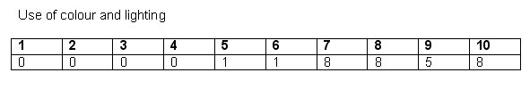


My results show that my video is a success, no scores are below five which is a brilliant result and most people liked my video. However, I have noted that my weakness appeared to be the use of shots and locations used.
Mise en Scene
There are four locations in my video; the fairground, Beverly Westwood, the bands rehearsal room and the Blue Room at college. The fairground is a setting that I did not create myself, the idea of these shots is to show the business of the fairground using mainly shots from the night, creating the atmosphere with the lights. Beverly Westwood is one if the settings were the singer performs. The scenery is snowy, therefore the singer is wrapped up warm in a big coat to make him look cosy. The blue room footage is supposed to look like the singer is in a performance. To do this I put a backdrop down to cover the blue walls and used a spotlight on him and I used props such as a microphone. Finally the room were I filmed the band performance was not set up by me because it was where they always practised, however they let me direct the way the looked and performed so that it would work well with my video.
Edit
My video mainly contains straight cuts to go along with the busy atmosphere I wanted to create, furthermore I have used some dissolving transitions to suit some moments in the video for example towards the end I have used this transition when the singer is singing to who is meant to be his girlfriend. Also to stop the video from being tedious I have used film syntax to see the singer and scenery at different angles.
Cinematography
My video starts with quick editing using cuts, quicker cuts go along to the beats of the music. When the singer being to sing I still continue to use straight cuts along with film syntax, however the shots are much longer in order to see the singer singing. The shots do vary from Beverly Westwood scenery to the blue room shots to create voyeuristic pleasure. When the song words change to 'Keep on running, keep, keep on running..' which is repeated six times I over lapped images so that you could see two pieces of footage of once, one image was of the fairground from the top of the big wheel ride and over lapping shots of the singer and band performance. For the ending I have used the effect of over lapping images again of the fairground and then it fades to black and white which symbolises the name of the song 'farewell to the fairground' and then fades to black.
Wednesday, 17 March 2010
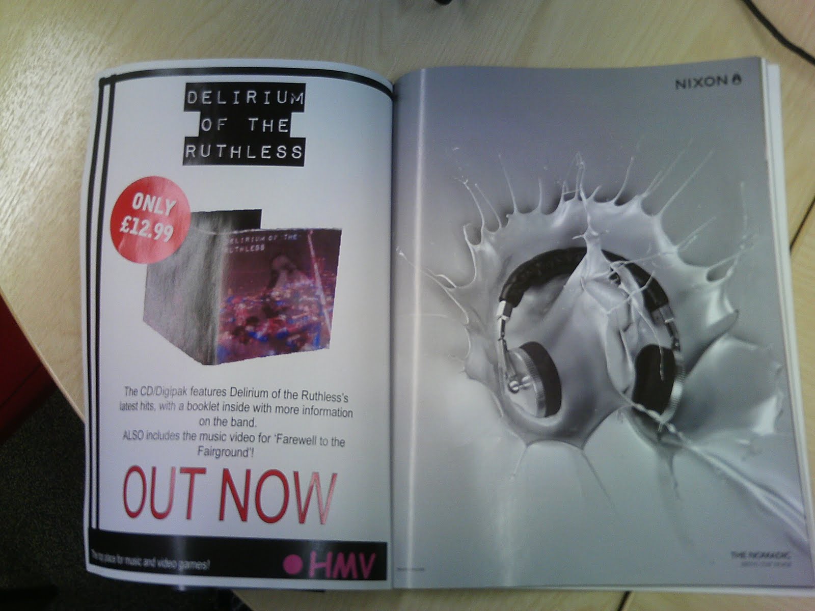
Magazine Advert complete
I created my magazine advert on publisher, once I finished it I printed it out and placed it in a real magazine to get an idea of what it would look like in a magazine.


Wednesday, 10 March 2010
Digipak Complete
 Front cover
 Back cover
 Inside cover


I created my digipak cover on Microsoft Publisher because it's an easy programme to use. I decided to fully create it so that I could have photos of what it would really look like. To do this I measured dimensions of a real CD case so that it was a realistic size. After I completed my designs I printed them out and stuck them onto some cardboard in the correct order. I then cut around the edges with a stanley knife and created folds at the right sides. I even created spine designs for the case. Once it was all cut out and stuck together I took photos of it against music and fashion magazines to create a collage like image of different forms of media. Most of the images are of women, which goes against the image of my work not being about sex.
Monday, 8 March 2010
Photos for cover
I have taken some still images from my video that I am thinking of using for the album cover, to do this I had to pause on my video which image I wanted and the click file, export image and save onto my memory stick to upload onto a laptop. The reason for this is because of the poll on the left side of my blogger. Looking at the results most people so far have voted for fairground images, this therefore means that the CD/Digipak cover will target towards my target audience.


Thursday, 4 March 2010


Magazine advert ideas for digipak

These ideas I have kept simple the idea is to attract
attention to the digipak cover and the price. I have also decided that it will be released in a 'HMV' store partly because this is one of the only stores that sell CDs/digipaks.


Sunday, 28 February 2010
Band name ideas
I thought of four ideas to call the 'band', would appreciate some audience feedback by voting on your favourite name.
1. Vengeance of truth
2. Fuse Craze
3. Delirium of the Ruthless
4. Fluorescent Great
The results of my poll was a tie between the name 3. and 4. therefore the final choice was up to me, so i have chosen Delirium of the Ruthless.
1. Vengeance of truth
2. Fuse Craze
3. Delirium of the Ruthless
4. Fluorescent Great
The results of my poll was a tie between the name 3. and 4. therefore the final choice was up to me, so i have chosen Delirium of the Ruthless.
Friday, 26 February 2010
Digipak Cover Ideas
Layout of Digipak


Idea 1
To ensure people are clear about this first idea, it is a plain black background with an image of the lead singer on the front and the name of the band. On the back it will have a list of songs featured in the digipak. In the bottom right corner there is a space for the album name, depending on which cover i do the album name will differ.
Idea 2
This cover idea is also plain black background with a picture of a hook a duck on the front. It may seem random and not mean anything but in fact it does mean something, it links to the fairground imagery because I filmed a hook a duck game at the fair. Inside the digipak it will have a CD and DVD (of my music video) which is the song 'Farewell to the fairground' by White Lies and because my video footage is at the Hull Fair, I thought this was a good way of symbolising the fair. Along the top there is the name of the band and along the bottom is the Album name 'Farewell to the fairground' also the name of the song for my video.

Idea 3
Unfortunately this is a small drawing, so it might not look clear as to what it is. It is in fact a view of the whole Hull Fairground from the top of the big wheel ride. It will be a night shot, therefore the image will look good because of the lights from the rides and stalls. The band name will be in the top right or left corner in white writing so that is stands out against the black background.

Idea 4
Final idea also relates to the fairground. It is an image of the big wheel, I most likely will use the night shot for the use of nice lighting, the day shot I have looks slightly dull. Once again band name along the top and album name along the bottom.

Wednesday, 3 February 2010
Research on the two additional texts
As well as creating a music video, I also need to create a digipak cover for the singles release and a magazine advertisement for the release of the digipak. In order to create a good cover for the single, I need to look and compare others.
DVD covers

The first cover I looked at is White Lies, simply because I am creating my music video to one of their songs. The image is of three factory towers, which is a location seen in the video for 'Farewell to the fairground'. The image is on black and white, the factory towers stand out the most because they are white, which relates to the band name. The band name dos appear on the cover at top, in the centre.

This album cover is for Razorlight. Also an indie styled band. It is similar to the White Lies cover, because it is also in black and white. However on this cover you can see the band, they are the main attraction to the cover. The name of the band is much bigger and takes up the full space on the top of the cover. Another similarity is that the background stands out because it is white, just like the three white factory towers on White Lies cover. The band members are all wearing similar clothing, skinny jeans and trainers, this idea is to relate to their target audience who will wear similar clothing, it's a stereotypical type.

This album cover for Blink 182 has a different feel to it, it looks like it has handmade products on it. The band name looks like letters cuts out of a magazine and stuck together to create their name. This cover happens to be for a particular single called 'I miss you', which is why it says it in the bottom right corner. The heart in the middle looks like a piece of paper with 'x' on it which symbolise kisses, in rows, which links to the idea of love. Once again like the White Lies the band members do not appear on the cover, maybe this pattern is to hide their identity.

Finally I thought I would look at something different. The album cover for the Beatles. This has been hand made, consisting of images of many famous people of the time. The band name has also been made up by flowers, which appears at the bottom of the cover. This album cover comes across as very different and must have taken a lot of time and effort to make. The Beatles do appear on the cover on the front row of people, I think this is mainly because they were a big hit of their time.
Magazine advertisements

This is an advertisement I found on google, its for The Killers new Cd/DVD of the concert they did at the Royal Albert Hall. In the layout the name of the band stands out the most for me, I think this is important because its makes the audience aware of who the band are and what they are promoting. After the huge image of what appears to be the Royal Albert Hall, it has the text of the bottom which is information on what the CD/DVD features. I think that this is a good advertisement and fits a similar genre to the song I am doing for my music video, therefor is good research.

This advertisement for Elvis Costello does not fit the genre I am doing, however its another way of laying out an advertisement. This is a magazine advertisement for three of his albums and involves pictures of what the albums look like and some further information at the bottom.

Monday, 1 February 2010
Filming Schedule/Health and Safety
October 2009, in this period I got all my filming of the fairground complete. I have made back up plans because the fairground isn't permanent, I had to ensure I knew what to do if shots needed to be re-done. To re film any shots there is a Location in Bridlington that does have a permanent fairground along the seaside.
Due to weather conditions over the Christmas period, not much filming got done. It would have been perfect weather if I wanted to have snow in my video, however I do not. I need the weather to be dry, for easier use of the tripod and the camera.
February 2010, plans have been set to travel over a weekend to get filming in Bridlington (new location) complete. Also during the weekdays of college I am booking the theatre for my own use to film the performance.
21/22.February.2010, almost all filming done on these days. I have got all the recording done for the images of the singer singing outside. A new location has taken place due to weather, it was important I got the filming done so the change had to be made. I am no longer having footage of the singer on Bridlington beach, I changed the location to Beverly Westwood. On these two days of filming it had been snowing, it became an advantage because the new location looked beautiful in the snow. The last bit of filming to be done is the shots of the band performance, this will hopefully take a couple of hours maximum this week then I can start to edit the footage.
01. March 2010, all my filming is now complete and ready to start editing. In this time I got all the shots of the lead singer singing in the blue room at college, I have used a backdrop to cover the blue wall. The singer looks like he is performing in a concert with a microphone and lighting on him.
Health and Safety
It was important that I took health and safety into thought for my filming. The hardest part was filming at the fair, because it was mainly my own safety I had to be aware of. I always made sure that I had plenty of room around me to film so that I didn't get in peoples way and wasn't to close to any moving rides. When I did the filming in the big wheel I had a friend with me, whilst I filmed the fair, they kept hold of me so that I didn't lean to far or drop the camera because it was hand held.
When shooting at Beverly Westwood it was snowing. I firstly ensured my lead singer was wrapped up warm enough and we had a break every so often to get a hot drink. Also when I filmed the girl she didn't have much warm clothing on so I had a spare coat and gloves for her to wear when she wasn't being filmed. To protect the camera I put a plastic board down for the tripod to stand upon and also I brought a waterproof sheet to cover over the camera to protect it from getting wet from the snow.
Finally when filming in the blue room, I ensured that all wires from the lighting was taped down, so that no one could trip over them. I also cleared away any boxes or folders that were in the way.
Due to weather conditions over the Christmas period, not much filming got done. It would have been perfect weather if I wanted to have snow in my video, however I do not. I need the weather to be dry, for easier use of the tripod and the camera.
February 2010, plans have been set to travel over a weekend to get filming in Bridlington (new location) complete. Also during the weekdays of college I am booking the theatre for my own use to film the performance.
21/22.February.2010, almost all filming done on these days. I have got all the recording done for the images of the singer singing outside. A new location has taken place due to weather, it was important I got the filming done so the change had to be made. I am no longer having footage of the singer on Bridlington beach, I changed the location to Beverly Westwood. On these two days of filming it had been snowing, it became an advantage because the new location looked beautiful in the snow. The last bit of filming to be done is the shots of the band performance, this will hopefully take a couple of hours maximum this week then I can start to edit the footage.
01. March 2010, all my filming is now complete and ready to start editing. In this time I got all the shots of the lead singer singing in the blue room at college, I have used a backdrop to cover the blue wall. The singer looks like he is performing in a concert with a microphone and lighting on him.
17. March 2010, Filming complete.
Health and Safety
It was important that I took health and safety into thought for my filming. The hardest part was filming at the fair, because it was mainly my own safety I had to be aware of. I always made sure that I had plenty of room around me to film so that I didn't get in peoples way and wasn't to close to any moving rides. When I did the filming in the big wheel I had a friend with me, whilst I filmed the fair, they kept hold of me so that I didn't lean to far or drop the camera because it was hand held.
When shooting at Beverly Westwood it was snowing. I firstly ensured my lead singer was wrapped up warm enough and we had a break every so often to get a hot drink. Also when I filmed the girl she didn't have much warm clothing on so I had a spare coat and gloves for her to wear when she wasn't being filmed. To protect the camera I put a plastic board down for the tripod to stand upon and also I brought a waterproof sheet to cover over the camera to protect it from getting wet from the snow.
Finally when filming in the blue room, I ensured that all wires from the lighting was taped down, so that no one could trip over them. I also cleared away any boxes or folders that were in the way.
Subscribe to:
Posts (Atom)
